Responsive Web Design Services
Did you know that approximately 90% of internet users have resorted to using multiple-screens to use the internet? If you plan to expand your business on an online platform—you will be required to authorize a website that is optimized to work on a maximum number of devices. We create responsive website designs for our clients that utilize a single URL and HTML code.
The implementation of a unique URL and HTML code enables the website to become optimized and consistent with the screen resolution to provide an optimum screening occurrence to the visitors that visit your website. With an increase in the types of portable devices, a responsive design concept facilitates the navigation of the website without any additional hassle.
Top three reasons why your website requires a responsive design
Google facilitates a responsive website
Responsive website designs are sustainable as compared to traditional website designs.
They support a mobile-friendly and a user-friendly interface.
The Smart Responsive Investment
If you are considering investing in making different websites that caters differently to a desktop website and a mobile website—you are probably not making an optimal use of your investment and resources. A smart responsive investment caters to:
Design-related changes along with time for text
Effortless tracking of your website’s performance to make transparent amendments
Money generated from the number of clicks, and how to deposit them
Responsive Design – Technical Details
Responsive websites utilize fluid proportion-based grids, flexible images, and CSS3 media queries which allow the content to
remain the same as the screen size shifts to a different resolution.
While a significant number of traditional, desktop websites tend to lose their functionality on smaller screens—a responsively designed website adjust text, graphics, and other elements according to the screen resolution of your website.
Our team members specialize in providing responsive web design services to our clients, and we create ideal and superlative websites that cater to devices of any kind by adjusting its resolution, image size, and scripting accordingly.
As a company of responsive design experts, we make cutting edge websites that effortlessly fit all machines by adjusting resolution, image size and scripting.
Same URL
Single Content
One Code
CSS3 Queries
Responsive website
Resolutions we'll take care of
Mobile
portrait

(320x480)
Mobile
landscape

(480x320)
Phablet
portrait

(360x640)
Phablet
landscape

(640x360)
Tablet
portrait

(768x1024)
Tablet
landscape

(1024x768)
PC
Browser

1024 onwards
Responsive Portfolio
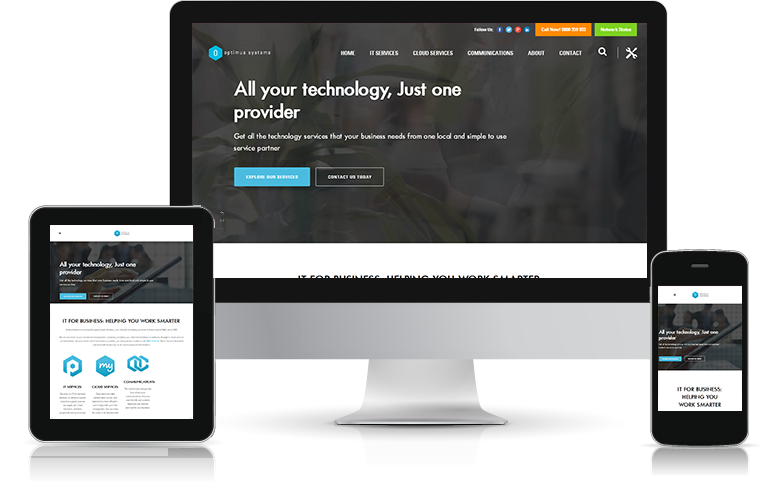
To become acquainted with the optimal responsive works conducted by the specialists at Full Stack Solutions—kindly check out our comprehensive Responsive Design Portfolio.
Speak to our project managers and learn how Fullstack Solution experts can help you dominate all types of devices with one superior responsive platform.
Request a FREE Quote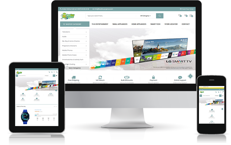

Cannot Find What You Are Looking For?
Feel Free To Consult Us
Ask an expert Our clients are amazing!
We love to hear what they say about our services.
STORIES OF PEOPLE IMPRESSED BY OUR SERVICE OFFERINGS
I thought I never receive the solutions for my web development, online marketing, and conversion optimization concerns but, the team at Full Stack Solutions was excellent at handling my concerns. Additionally, they continued to support me after I launched my website. Strongly recommended!
Arkwise
Battery Hill, Australia

You cannot go wrong with the excellent services provided by the team of Full Stack Solutions. I have never met a team as cooperative and accommodating as Full Stack Solutions’ team. If you have any concerns regarding web development or website designing—they will take care of it.
Ccojab
Mexico City, Mexico

I was concerned about hiring the services of a company who would take care of my concerns. I must say that the team and services of Full Stack Solutions took care of my problems within an estimated time-period.
Bestbuycyprus
Limassol, Cyprus

As an online marketer, I couldn’t establish my presence online due to the lack of business leads and high bounce rate on my website. With the assistance of Full Stack Solutions’ services, I was able to ascend the success of my business on an online platform.
Gabbyratner
Bellevue Hill, Australia

The cooperative team of Full Stack Solutions really stands up to their words by providing immediate and effective services. I am strongly impressed by the integrity and veracity of the team employed at Full Stack Solutions.
Harymilas
Melbourne, Australia

The cooperative team of Full Stack Solutions really stands up to their words by providing immediate and effective services. I am strongly impressed by the integrity and veracity of the team employed at Full Stack Solutions.
Kenkira
Fishing Point, Australia

The cooperative team of Full Stack Solutions really stands up to their words by providing immediate and effective services. I am strongly impressed by the integrity and veracity of the team employed at Full Stack Solutions.
Kiawmous
Norsbog, Sweden

The cooperative team of Full Stack Solutions really stands up to their words by providing immediate and effective services. I am strongly impressed by the integrity and veracity of the team employed at Full Stack Solutions.
David
World Square, Australia

The cooperative team of Full Stack Solutions really stands up to their words by providing immediate and effective services. I am strongly impressed by the integrity and veracity of the team employed at Full Stack Solutions.
Rudolphe
Australia

The cooperative team of Full Stack Solutions really stands up to their words by providing immediate and effective services. I am strongly impressed by the integrity and veracity of the team employed at Full Stack Solutions.
Steveco
Qweqwe, United States

The cooperative team of Full Stack Solutions really stands up to their words by providing immediate and effective services. I am strongly impressed by the integrity and veracity of the team employed at Full Stack Solutions.
Strohmy
Chiang Mai, Thailand
Results motivate us
Website Developed
By Fullstack Team
2K+
Client
Satisfaction Rate
95%
Total Countries
Served
80+
Get in Touch with Us
We sign NDA for 100% confidential consultation

Copyright © 2013-2024 Fullstack Solutions. All rights reserved.